Related links
 Homepage
 User documentation
 Uživatelská dokumentace
Framework Core functionality
- AyMINE Framework Server
- Configuration of the user-defined fields
- Client-Defined attributes
- Default server methods
- Strings and translations
- User sessions
- Import collection of objects
- Multi tenant Architecture
- The AyMINE licence model
- Export collection of objects
- System messaging
- System Rights
- File Management with End-to-End Encryption
- Server configuration for large files
SOA / Event Management
Support for Service Object Architecture and Internal Event ManagementModule - support for management
Front-End Scripting
System Management
- SaaS Management Module
- Management of the SaaS service client
- Encryted wallet storing access keys for data vault
- Definition and Management users in the SaaS system
- Management of the system users
- System right management
- System role is how user administrator sets the rights
- File access, storing and locking
- Communication geateways
- Private Object Marks, Sign & Notes
Task Management Module
- About TSK module
- Support for voting and decision management
- Support and implementation notes for FMEA
- Support for the Methodology Management
- Project Methodology Support
- Project Roles - Data model and implementation notes
- Actions and Meeting Agenda
- Description of person and supplier competencies
- Business event
- Problem & Helpdesk management support
- TSK module releases
- User Reminder
Task & Task pattern
Mobile & Web Application
- Client-Side Scripting using API
- Application Object Structure
- Clipborad Link - Cliplink
- fclip
- drag-drop
- AyMINE Application
- objectdefinition_inlineedit
- clientprogramming
- mobileapplication
- languagesupport
- objectdefinition_multiupdate
- Object API – object <g>
- clientprogramming_fevallanguage
- clientprogramming_fevaluser
- objectdefinition_viewdefinition
- offlineobjects
- System console
- Runtime debugging
- objectdefinition_detailview
CMS - Content Management & Web API services
FI - Finance Management
CRM - Customer-Relationship Management
Sales & Asset management
Sales related services
Description of a part of the AM module - sales partView of a single object – detail
Technical information how is an object detail view created from the object declaration file.
- How is the detail of object created
- Page with view generated by back-end
- Detail view format
- About the parts
- Box
- Methods
Detail view displays single object with related information from other objects. Detail is organised in the blocks. More complex details could organise blocks to the tabs.
How is the detail of object created
Detail view could be created by several ways:
- Created from the declaration in the jsonc file
- Developed as a standalone js/ts (java script / type script ) object
- Page generated by the back-end
The chapter describes the first approach because it is used by almost all pages. So the others are mentioned only briefly and compared with the first variant.
Separate view created by a standalone java script code
The standalone declaration makes sense in cases
- View uses visual components not supported by the universal engine
- View provides data calculations or manipulations that could interact with user.
Let's mention that also generally declared view could call externally developed method in a module-defined type scrip library.
Examples:
This approach is used by two views – user settings and list of system roles. For user settings it makes a sense, the system role setting has no reason and jsonc declaration would be 100% sufficient. (The only reason is historical – system roles is one of the oldest objects and concept of the jsonc view declarations weren’t yet developed.)
Why standalone view development is not recommended?
View developed as an independent type script / java script module requires more complex programme management – each update will require change of the application including mobile applications. Change of the declaration requires only reload data and changes are deployed.
Dynamically loaded modules are not supported for iOS deployment. Thus, view update requires rebuilding the application and update is far more complex than just change the declaration.
Page with view generated by back-end
Application does not generally work with back-end generated pages although they could be integrated and opened from the application.
Back-end pages do not share application data. They are about 10 times slowly and requires although more than 10 times larger data transfer than detail generated by application.
See chapter about back-end pages for more details.
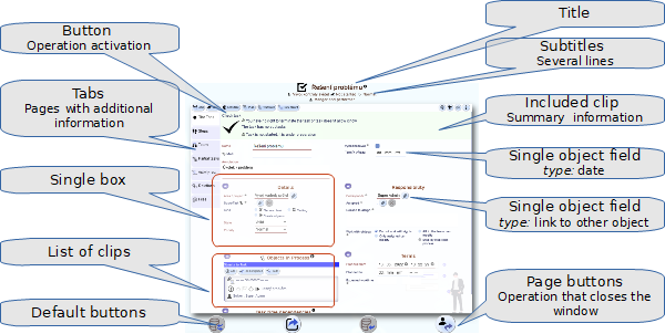
Detail view format
The whole detail is described by the jsonc definition file in the following structure:
"<view name>":{  "extends":"<name of the basic view>"
   "parameters": {
      "userNotes":true, "reminders":false, "userSigns":true,
      "editable":"<condition>",
      "readonly":"<condition>"
   },
   "window":{"width":<width>, "height":<height>},
   "subtitle":"/** areaSubtitle **/",
   "tabs": {
      "tabA":{  "icon":"hierarchy",
         "dataLabel":"=obj.subCount > 0 ? `(${obj.subCount})`:false",
          "visible":"= !obj.isNew",
          "boxes": ["<box 1>", ... "<box N>" ] },
      "tabB":{
         "icon":"<name of the icon on the tab>",
         "visible":"<condition to show the tab>",
         "dataLabel":"<script that calculates mark on the tab>",
         "view":"<name of the slave view placed to the tab>" },
   },

   "boxes":{
      "boxA":{
         "showTitle":false,
         "order":"AA",
         "view":"form.this.clip.checkArea",
         "style":{ <specfic box releted style in the js.css format> }
      },

      "boxB":{
         "order":"BA",
         "attributes":{
            "parentArea":{
               "viewSelect":"this.list.myActiveAreas",
               "where":"<aditional were condition for list view>"
            },
         "name":{ "order":"A"},
         "shortDesc":{"type":"longtext", "order":"C"},
         "userType":{ "order":"D"},
         "status":{ "type":"listbox", "right":"=obj.status != 'DE'", "order":"E"},
         "responsibleID":{ "order":"F"}
      }  },

   },
   "attributes":{ <attributes that are not visible but are loaded>  },
   "menu":["<menu field 1>" ... "<menu field N"],
   "pageButtons":["<page button 1>" ... "<page button N>"],
   "methods":{
      "<method name>":"<script evaluated to calculate the method>"
   },
   "operations":{
      "<operation 1>":{
            "icon":"<icon on the operation button>",
            "enabled":"<condition when user can use the operation>",
            "command":[
               <command script>
            ]
      },
   },
   "afterSave":"<operation called after save>",
   "serverData":{
      "selectFROM":"<name of the view to read the data for detail>",
      "selectWHERE":"<where condition applied to the data>"
   }
},
About the parts
"extends":""
Views are internal objects and a view can be derived from other view of the same type. It can even be derived from view from another object. Thank to that it is easy to created several similar views for various purposes (e.g. with some different fields). Just create an abstract view and derive more specific that add addition elements (tabs, boxes. operation, ...)
Parameters
Marks that specify how object operates:
/** Optional view attributes */
interface iviewParameters {

   /** Optional parameters allows settings parameters values directly for clip,
    * simplify parameter transfer and overload code.
    * If clip has self attributes defined, these has higher priority
    * than those that comes from parameters
    */
   clipParams?: fclipParams

   /** Name of the view principal object
    * * User for clipLists and lists – it allows defined another object to be principal
    * * Totally disregard by serer
    * @example for tskAreaTasks setup principal object is tskArea
    * although it is stored in the tskTask object where several different list can share abstract set
    */
   principalObject?: string

   /** All items are read only and operations are disabled
    * * for detail view evaluated with respect to the loaded object,
    * * for list view evaluated with respect to the principal object –
    * e.g. for list of area tasks in response to the area –
    * However, be careful to check, if used parts of the principal
    * objects are always loaded in context where list view is used
    * * Can be list collected from read only conditions inherited from ancestors */
   readonly?: boolean | string | string[]

   /**  equal to editable, item is read only in case that this is false –
   * clause simplification, not used if read only defined;
   * has lower priority than read only but it is strongly recommended not to use both of them */
   editable?: string

   /** Optional evaluated right for view. Makes the same as visible
    * (later and allows defined independent controls especially for clip)
    *
    * Makes no sense and is __not supported for list__
    */
   right?: string

   /** Optional attribute that can disable view even when user has global right to see it;
    *
    * * Use it for objects that are enables/disabled in according
    * to some of their attributes _(example:  tskDefTask, tskTask)_
    * * Note: __Setup list rights properly__. When rights set correctly for list,
    * user cannot even list objects which detail cannot open!
    * It is safer and user won't see even data from the list
    * * Make sense for views that are open as fast-view lookup
    * from other details (look at the linked document)
    * * Makes no sense and is __not supported for list__
    * */
   visible?: string

   /** method called when user clicks on the new button
   * Note: not yet supported for list view, BUT SUPPORTED for calendar view
   */
   newAction?: string

   /** setting for button lines  */
   buttonLine?: buttonLineSettings

   /** setting for the command line */
   commandLine?: buttonLineSettings

   /** setting for menu items */
   contextMenu?: buttonLineSettings

   /** Mark that view offers userNotes to the object – currently active only for detail */
   userNotes?: boolean

   /** Mark not to show common buttons ok/save/cancel
    * Currently supported only by client
    */
   noDefButtons?: boolean

   /** Mark that people can send reminders to someone else with the object.
    Creates new button in the button line */
   reminders?: true

   /** Mark that it uses its own readonly control.
    * When true, parent detail does not control readonly status of the view
    * @example see tskTask--reluser
    */
   selfReadonly?: boolean

   /** Mark that view supports showing / editing object marks
    * when true view tries to show sings and works with them
    */
   userSigns?: boolean

   /** When true, dialog offer Save & New button to save item and open detail for a new one */
   snewButton?: boolean

   /** List of controls that are specific for view and made before save
    * * Note: when user does not set value to the attribute,
    * controls defined for a field are not performed.
    * So that if control should
    * check null value, it should be defined in this section.
    * * Supported only by univDetail safe function nowhere else
    * * each field is evaluated by the javascript eval function, they are not operation!
    * @example sysFile – there are 3 fields that can be null but not all,
    * control is made using this option
    */
   beforeSaveControls?: dataControl[],

   /** options disable filters on the table header line.
    * Use this option for tables that have only a
    * few lines and user operates close to the heading
    * (typically list of few lines in the details)
    *
    * Parameter
    *  * Removes the menu on the cell header
    *  * Limits options in the menu on on the select-column
    *  * blocks button to show more columns
    * Default values is false – no limited scope
    *
    * Field enabled and right are evaluated for command as well!!!
    * They can be used to check where function should run or not.
    * Evaluation used actual object status
    *
    */
   noFilters?: boolean

   /** Set up if view has to show the help button next to the name
    *
    * _Options are:_
    * * (boolean) true – show help if defined for object (default)
    * * (boolean) false – do not show help event when defined for object
    * * string – name of the help for this view –
    * should be valid name of the MD file in the /module/langs/@/ directory
    *
    * _Notes:_
    * * subviews has not visible header and thus does not support help file at all
    * * clipList support the help but the clip detail does not,
    * clip disregard the parameter,
    * clipList supports only clip-specific help, not common
    * * dashboard supports clips but only clip-specific (help should be a string;
    * boolean value is ignored and help si not available)
    */
   help?: boolean | string

   /** When set, user cannot set more than a single column.
    * Equal to the open selection only for select single element
    *
    * Used only for list parameters
    */
   singleOnly?: boolean

   /** Settings that set defViewName option of the univDetail
    * Changes how name of the window is defined and uses
    * default name from translation instead of the object name
    * Supported only by univDetail
    */
   defViewName?: boolean
   /** icon position in the view (currently supported only by clip detail in full scope)
    *  * positions are defined by the view structure
    *  * top positions are in the size of the large letter
    */
   iconPos?: 'left' | 'right' | 'leftTop' | 'rightTop'
   /** optinal style for page container
    *
    * Example for list (sysRole):
    * "style":{
    *    "placement":{"minHeight":"auto"},     // style for the placement of the list
    *    "listtable":{ "minHeight":"auto" }    // style for div in which is located table
    * }
    *
   */
   style?: any,
   /** Optional parameter setup default menu operation that call printing */
   printOperation?: boolean
}
Note: The description here could be outdated. For programming, always check actual documentation in the objectDesc.d.ts file, part of the AyMINE framework. The type definition file contains details descriptions of all elements and is constantly updates
"window":{"width":, "height":},
Window size is used only in case that user opens the window as a standalone window (using ctrl+click).
"subtitle":"/** areaSubtitle **/",
Definition of the subtitle lines. There could be single line definition as string or multiline as a array of string.
The file format allows using the multiline comment for complex string definition. The multiline string should be referenced by its name as is in the example line.
Tabs
Tabs defined pages / tabs that split detail to the several pages. (BTW. tabs could be both horizontally or vertically organised by scss styles. The layout is defined by styles, but when necessary style hint could be in the view definition – e.g. name of the substyle).
Tab can contain single view, single box or several boxes. Order of the boxes is not defined by the order in the list of boxes names but by
- If box definitions contains order attributes, it defined the order
- By order of boxes in the boxes section elsewhere.
Box
Box could contain:
- single view – detail of related object, clip, list of related objects (not calendar!),
- list of attributes from object
Attributes are organised by application itself. Some modifications are available using the fields attributes.
Min – max values
When two fields are counterparts of some interval (dates, currency, number values etc.), the could be defined to be located at a single line:
"timeExpectedMin":{
   "counterpart":"timeExpectedMax",
   "margin":"bottom",
   "label":"timeExpected",
   "visible":"<condition when visible>" },
"timeExpectedMax":{
   "counterpart":"timeExpectedMin",
   "margin":"up",
   "visible":"<condition when visible>" },
- counterpart – Name of the second field at the same line
- margin – bottom | up – distinguish which part of the line is that value
- label – how to call the values, should be in the 1st field, ignored in the second. Optional, but if not used name of the 1st field is used which is probably wrong, because label should reflect the fact that it is a label of the interval of both values
- visible – condition when field is visible
Remember:
- Fields should be in the order min – max in the list of fields
- Use visible, right conditions for both fields, they are evaluated independently
- Don’t use the interval fields for date+time fieds. They are too long to be used on a single line
- There is internal logic that controls that min + max are in the interval. The logic is applied automatically so that user cannot put larger value to the bottom field than to the up field. However, user can set only single value and the second leave empty (null). If both should be filled they should be marked both as required. If user can set none or both values, an additional control should be placed:
“attributes”:{
   "timeExpectedMin":{
      "type":"int",
      "check":"=obj.timeExpectedMax",
      "checkWarn":"msgFillAlsoMax"
   },
   "timeExpectedMax":{
      "type":"int",
      "check":"=obj.timeExpectedMin",
      "checkWarn":"msgFillAlsoMin"
   }
}
Check controls related with attributes are defined for object attributes, they are not part of the view definition. View-related definitions could be also defined as part of the view:
"<view name>":{
   "parameters":{
      "beforeSaveControls":[
         {"check":
            "= !((obj.timeExpectedMax && !obj.timeExpectedMin) || (obj.timeExpectedMin && !obj.timeExpectedMax)) ",
            "checkWarn":"msgFillMinAndMaxOrNone" }
      ],
   },
}
Let's note the warning strings (e.g. msgFillMinAndMaxOrNone) are always translated So put them to the object-related translation strings.
Methods
Methods are calculated before the rights evaluation and before detail is showed. The method results could be used in the rights condition. When single condition is used for several fields or boxes, put them to the method and reuse everywhere when necessary
"methods":{
	"isResponsible":"= [obj.isManager??0, obj.isDeputy??0].includes(user.ID)"
},
"boxes":{
	"box1":{
		"enabled":"=obj. isResponsible"
   }
}